001
Introduction
Client
MovementBase.
Timeline
3 Weeks
Year
2026
MovementBase helps social justice changemakers save time, reduce burnout, and scale impact through an affordable, all-in-one system.
My Role: UX/UI Designer on a 5-person team
Timeline: 3-week sprint
Tools: Figma, FigJam, After Effects, Photoshop, Procreate
Deliverables: Member Portal, Admin Portal, Hi-Fi Prototype, Style Guide

Empowering Social Justice Organizations with Unified Digital Infrastructure
Project Overview
MovementBase serves as the digital infrastructure for membership-based organizations—providing one platform to manage members, programs, and movement work. The platform helps social justice changemakers save time, reduce burnout, and scale impact through an affordable, all-in-one system.
Their theory of change is that when organizations have the right digital tools, they can better reach, engage, and activate their members—unlocking far greater collective impact.
002
The Challenge
The Challenge
We were tasked with creating three interconnected solutions:
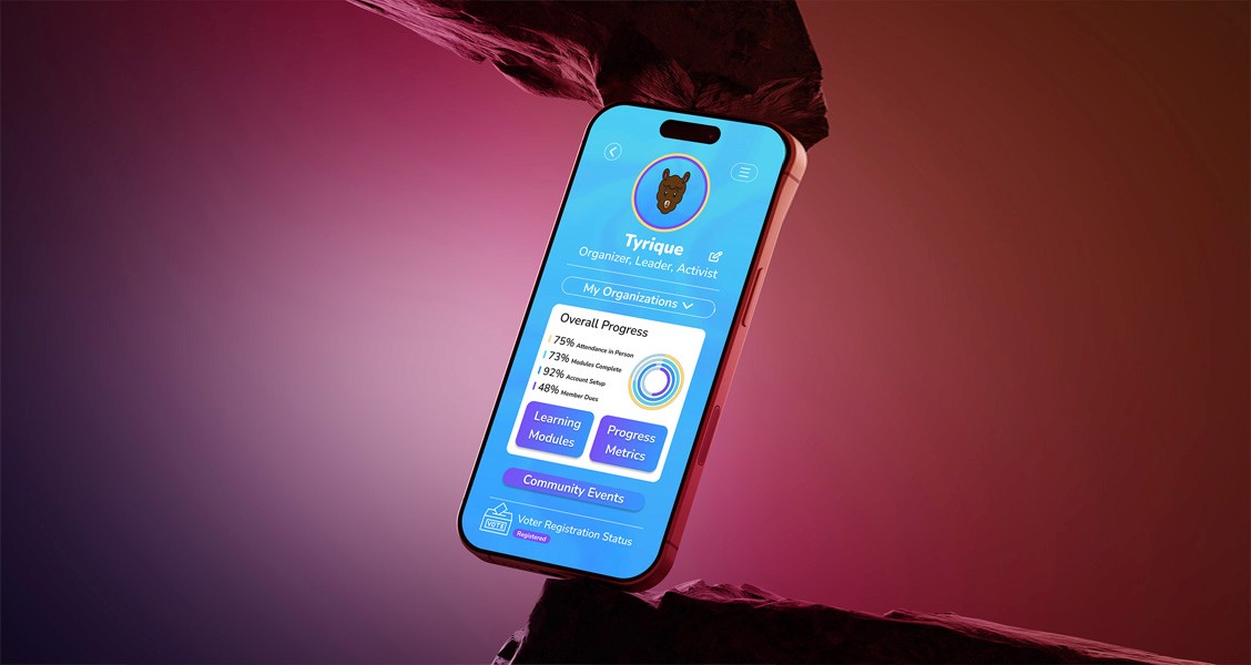
Unified Membership Portal (Member View)
A centralized hub that consolidates all member interactions—completed actions, workshops attended, and progression through engagement levels—into one motivating and intuitive interface. The portal needed to highlight badges, achievements, participation, and leadership pathways with clear progression steps from engaged resident to leadership roles.
Admin Portal (Organizer/Funder View)
A powerful analytics dashboard to allow organizers and funders to measure engagement and assess program impact. The portal needed to provide an overarching view of programs and members with easily filterable and well-formatted data for stakeholders.
Redesigned Member (Learning) Portal
An expansion beyond the existing "Learning Portal" to encompass a wider breadth of member activities. The redesign needed to accommodate visualization of member participation across programs, workshop assessments, attendance, pre-/post-tests, surveys, self-guided multimedia learning, and intuitive navigation between these categories.
003
The Reserch
Research & Discovery
Our team conducted comprehensive research to understand user needs and the competitive landscape.
Comparative & Competitive Analysis:
We identified two key competitors to learn from: Duolingo for the educational experience and Salesforce for the admin functionality.


Impact Towards Solution:
We adapted Duolingo's gamification principles specifically for nonprofit educational modules, creating an engaging member experience that tracks skill development and community leadership growth. For administrators, we designed a platform more relevant than Salesforce by including nonprofit-specific features such as grant journey management, program impact tracking, and stakeholder-ready reporting—all at an accessible price point.
Research Interviews (8 Participants):
We conducted 8 initial interviews with both community members and nonprofit administrators to understand their workflows, pain points, and aspirations.
Affinity Mapping:
Through affinity mapping, we synthesized research findings to identify key themes and priorities for each user group.

Discovery Synthesis:
We synthesized findings from initial interviews into “I” statements using affinity mapping. This step helped clarify user needs and pain points and directly informed persona development, ensuring our design decisions were rooted in authentic user perspectives from the start.

Educational Users Prioritize
Gamification (rewards for engagement and participation)
Ability to track progress
Simple interface
Timely event check-in
Admin Users Prioritize
Data collection, transfer, and presentation
Ability to track member engagement
Ability to upload learning modules
Simple interface, easy to use
Understanding Our Users
Through research interviews and affinity mapping, we identified two distinct user groups with different needs and pain points. Two detailed User Personas were created (Tyrique Smith and Tracy Williams) to guide design decisions and ensure we stayed focused on real user needs throughout the project.
Persona 1: Admin Data
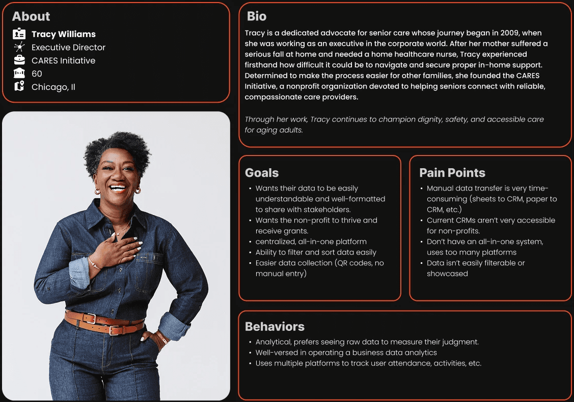
Tracy's Problem Statement:
Tracy needs a clear, unified place to collect, organize, and present her nonprofit’s data, because managing information across multiple tools and manual systems prevents her from quickly understanding impact, making informed decisions, and communicating results to funders and stakeholders.
Persona 2: User Education
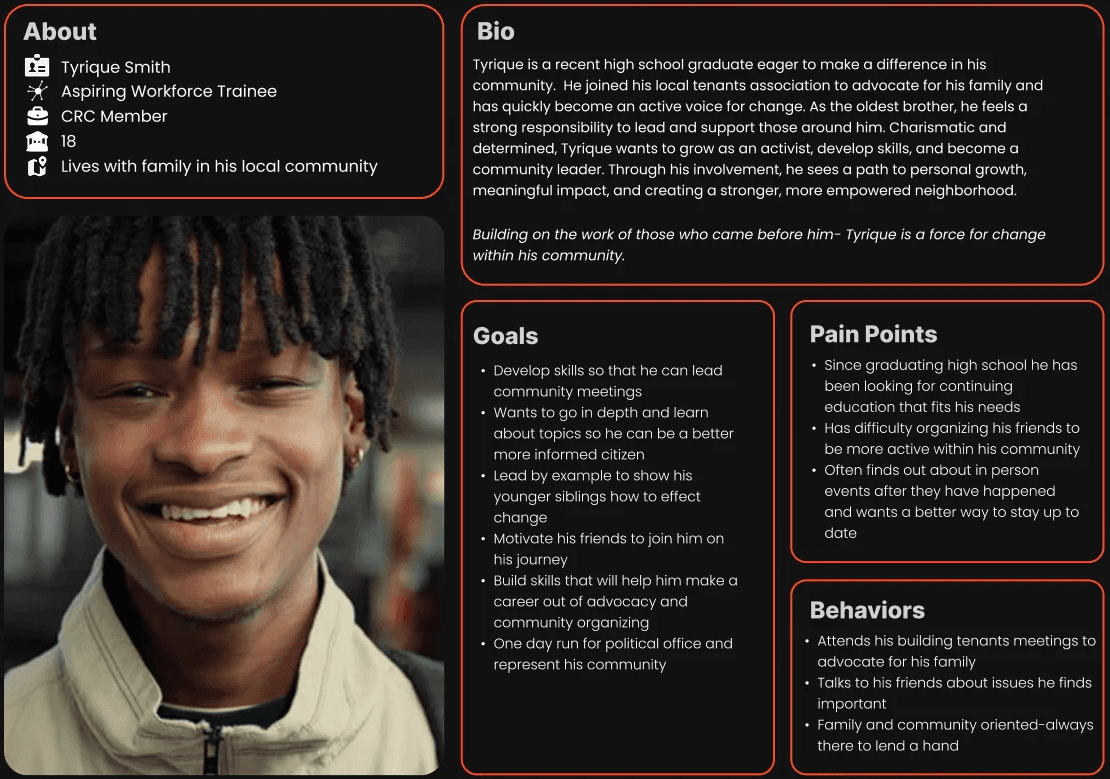
Tyrique's Problem Statement:
Tyrique is dedicated to improving his community but faces barriers that limit his impact. He struggles to engage and organize peers and often learns about events too late to participate. He also lacks accessible learning opportunities to build leadership and advocacy skills, making it harder to lead meetings or mobilize others. Without timely information, practical training, and tools to coordinate his peers, Tyrique cannot fully develop as an advocate or drive lasting change in his neighborhood.
004
The Design Process
The Design Process
Based on our research insights, we moved into an iterative design process focused on solving the core needs of both user groups.
This is where we start creating solutions to our client's problems
From Sketch to Structure
Early sketches served as a sandbox for exploring ideas without constraints. By sketching flows, screens, and interactions, we were able to quickly test assumptions, compare approaches, and refine the structure of both portals before translating the strongest concepts into wireframes.
Defining the Core Experiences:
To ensure we addressed the full scope of both user experiences, we identified and sketched the key surfaces required for each user type before moving into wireframes. This helped us validate structure, prioritize content, and align on feature requirements across the Member and Admin portals.
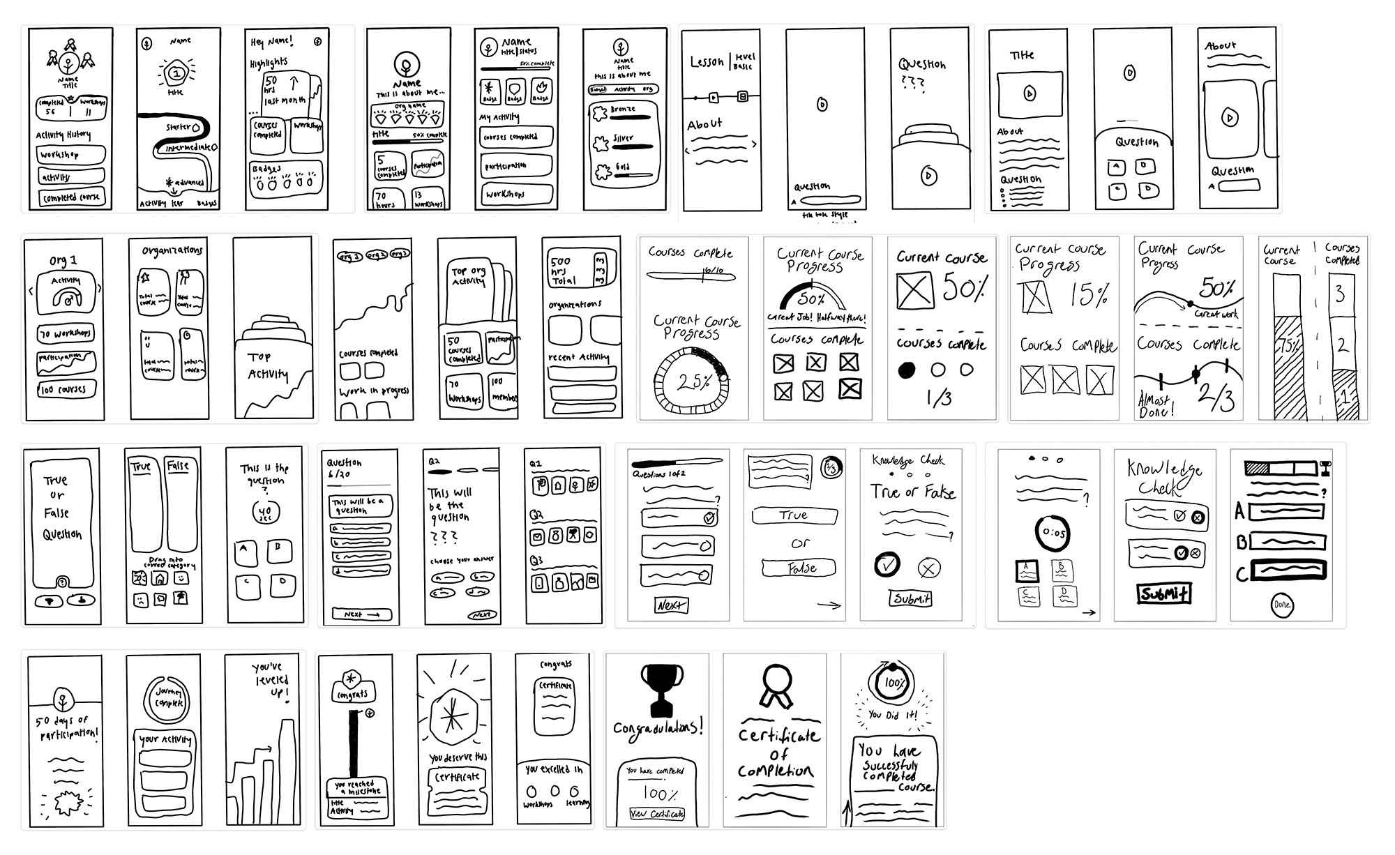
Educational user experience sketches exploring learning, progress, and engagement flows
(Educational User) Sketches
Core pages and flows explored:
User profile
Organization
Title/role
Badges/courses completed
Bio (general user info, demographics, etc.)
Selection of organizations' personal metrics home page
Courses completed, work in-progress
Video lesson
Knowledge check
Multiple choice/ true false
Certificate

Admin user experience sketches exploring learning, progress, and engagement flows
(Admin User) Sketches
Core pages and flows explored:
Org metrics
Attendance rate (in person events)
Member engagement ( learning modules)
Upload modules
All members accounts
Individual members
Households
Exploration → Alignment → Structure
As patterns and priorities emerged from these sketches, we aligned on the most effective flows and layouts for each portal. With a shared structural direction in place, we transitioned into low-fidelity wireframes to formalize information hierarchy, navigation, and core user journeys.
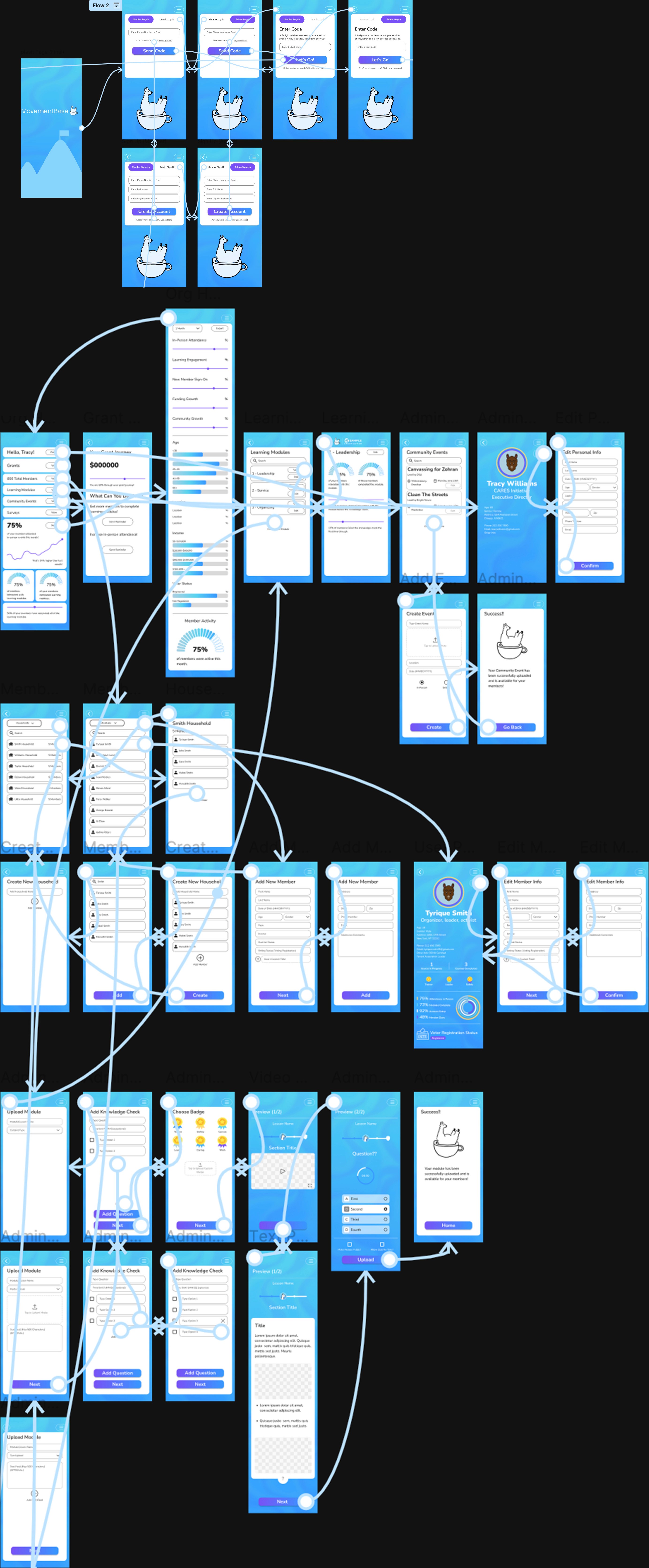
Wireframing
Developed low-fidelity wireframes to explore information architecture, layout options, and core user flows across both the Member and Admin portals.

Usability Testing & Feedback (6 Participants):
Conducted six usability testing sessions with target users, including high school students representing the Tyrique persona, to validate assumptions and uncover usability issues before advancing to high-fidelity design.
Key Findings from these sessions directly informed the following design improvements:
Clarified which data points matter most to stakeholders and grant writers, leading to a more focused and report-ready Admin dashboard.
Identified confusion around badge types on user profiles and refined visual differentiation to make achievements clearer and more motivating.
Discovered a gap in event workflows and added in-person event sign-in to better support real-world participation.
Addressed navigation accessibility issues by updating back and menu buttons to meet WCAG standards.
Hi-Fi Protoype:
Created polished, interactive prototypes with full visual design, incorporating insights gained from usability testing.
Prototyping: User Education

Prototyping: Admin Data
005
Key Design Solutions
Key Design Solutions
Guided by research, testing, and close collaboration with MovementBase, we designed a set of core features that support two distinct user experiences within a single platform. These solutions balance motivation and clarity for members with efficiency and insight for administrators.
User Education Portal Features
Gamification System:
Implemented badges, achievements, and visual progress indicators to motivate continued engagement and celebrate member milestones.
Leadership Pathways:
Designed a clear progression visualization showing the journey from engaged resident to leadership roles, helping members understand their growth trajectory.
Activity Dashboard:
Created a centralized hub displaying workshops attended, actions completed, and program participation in an intuitive, motivating interface.
Event Management:
Added sign-in capability for in-person events and improved event notifications to help users stay informed and never miss opportunities.
Admin Data Portal Features
Admin features were designed to support real-world reporting, grant applications, and organizational decision-making.
Anylitics Dashboard:
Designed comprehensive analytics views showing engagement metrics, program impact, and member activity patterns for data-driven decision making.
Data Visualization:
Created stakeholder-ready data presentations with filtering and sorting capabilities, formatted specifically for grant applications and reports.
Member Overview:
Developed a holistic view of all programs and members, enabling organizers to quickly assess organizational health and identify trends.
Simplified Data Entry:
Streamlined data collection processes to reduce manual entry and time spent transferring information between systems.
006
Design System & Visual Foundation
Design System & Visual Foundation
To modernize the platform while respecting MovementBase’s existing brand, we created a cohesive design system that serves as the visual foundation across both portals. The system was built to ensure consistency, accessibility, and scalability while supporting future feature expansion and long-term product growth.
Color Pallet
Our color choices were derived from MovementBase’s existing brand and website textures, ensuring visual continuity while improving flexibility and usability within the product.
Purple:
#7850F5
We introduced a lighter purple inspired by MovementBase’s existing brand color to improve balance and flexibility within the UI. The updated shade preserves brand recognition, works more effectively alongside the expanded palette, and meets WCAG contrast requirements.
Yellow Accent:
#FED87B
Introduced a new accent color to complement MovementBase’s existing palette. The yellow adds energy and warmth, and is used intentionally to highlight achievements, badges, and key calls-to-action within the gamification system.
Existing Brand Colors:
Preserved MovementBase’s core brand colors from their website and marketing materials to maintain consistency across the platform and support future expansion.
#EEEEEE
#ADD1E1
#5AD2F0
#4BB1F1
#3798FF
Typography
To maintain brand continuity while supporting a more approachable and accessible interface, we revisited MovementBase’s typographic history before selecting a primary typeface.
Selected Type Face: Nunito
Nunito was chosen over the existing typeface, Lato, based on its prior use within the MovementBase brand and its suitability for the updated product experience.
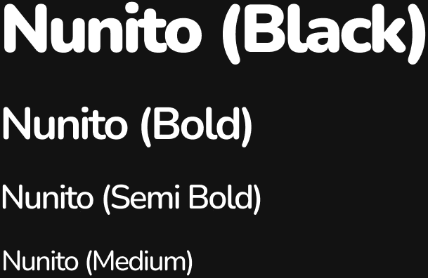
Rationale
Nunito’s rounded terminals complement the soft geometry used throughout the interface, helping create a warm, welcoming tone that aligns with the community-focused mission of social justice organizations. The typeface also performs well at multiple sizes, supporting readability across dashboards, forms, and learning content.
Brand Evolution
This decision represents a thoughtful return to a familiar brand element while refining it for a more modern, scalable product experience. It preserves brand recognition for existing users while better supporting the platform’s evolving needs.
Design Language
The visual system was designed to feel friendly, clear, and consistent across both portals, while remaining flexible enough to scale as the platform grows.
Rounded Corners
Used consistently to reinforce approachability and accessibility throughout the interface.
Card Based Layout
Enable modular content organization, making complex information easier to scan and understand.
Iconography
A custom icon set designed to mirror the rounded, approachable visual style of the interface.
White Space
Applied intentionally to reduce cognitive load and improve overall readability.
Together, these elements form a cohesive visual foundation that ensures future features and modules maintain consistency in both look and experience.

007
Future Recomendations
Future Recomendations
While the project delivered a comprehensive solution within a tight three-week timeline, several opportunities emerged for future enhancement.
Phase 2 Opportunities
Desktop Admin Experience:
Optimized layouts for admins managing data from office workstations
Enhanced Learning Module Uploads:
Support for pre-tests, post-tests, and surveys within the platform
Funder View:
A dedicated interface allowing foundations and grant writers to access reports without admin-level complexity
Greyscale Accessibility Toggle:
An optional mode to improve readability and support diverse visual needs
Together, these elements form a cohesive visual foundation that ensures future features and modules maintain consistency in both look and experience.
008
Reflections and Learnings
Reflections and Learnings
This project reinforced the importance of designing for multiple user groups with distinct needs while maintaining a cohesive platform experience. Balancing the motivational, progress-focused goals of members with the analytical, data-driven requirements of administrators required careful attention to information hierarchy and feature prioritization.
Key Learnings
Competitive Analysis as a Design Foundation
Studying platforms like Duolingo and Salesforce helped identify effective patterns such as gamification and rewards, while also highlighting gaps related to cost, complexity, and nonprofit-specific needs. These insights guided us toward a more focused and differentiated solution.
Client Communication is Critical
The rapid three-week timeline demanded quick, informed decisions supported by consistent communication. Ongoing collaboration, rather than milestone-only check-ins, reduced friction and kept the team aligned throughout the project.
Designing for Impact
Working with social justice organizations reinforced that thoughtful design can directly support real-world change. By reducing administrative overhead, our solutions help organizers spend more time engaging their communities.
Collaborative Design Process
Working as a five-person team emphasized the value of clear communication, shared documentation, and regular check-ins to maintain consistency across multiple portals and features.
Together, these elements form a cohesive visual foundation that ensures future features and modules maintain consistency in both look and experience.
008
Final Thoughts
Final Thoughts
This project challenged our team to design a unified platform that serves both community members and nonprofit administrators with very different needs. By grounding decisions in research, validating assumptions early, and collaborating closely with stakeholders, we delivered a system that improves engagement, reduces operational friction, and supports real-world impact.
MovementBase reinforced my approach to designing complex, mission-driven products: